Magazines

Focusing on street art, graffiti and creative urban culture, UP is a provocative cutting-edge NYC-based quarterly magazine.  Launched in spring 2019, each issue spotlights a specific theme. Its first (sold-out) issue features several articles on money-related issues, and its second highlights matters of travel and place, as they relate to urban culture.

Lower East Side-based photographer Anna Candelaria introduced me to UP, and I was impressed by its in-depth coverage of the contemporary global urban art scene. Last week, Ana joined me as I met up with its chief editor, T.K. Mills.

Can you tell us a bit about UP Magazine‘s mission?

Our mission is to provide the art community with provocative writing that reflects the critical issues of our generation. We strive to present to our readers high-quality articles that investigate, inform, and entertain. Like good art, UP Magazine is made to make you think and make you feel.

What attracted you to urban culture? Particularly street art and graffiti?

After I had received my Masters Degree in Global Affairs from NYU, I wasn’t quite sure what direction my life would take. Shortly after Trump was elected President, I decided to visit Cuba. That’s where I first discovered my love for graffiti. I kept seeing 2+2=5. It seemed to be written everywhere. At first I couldn’t figure it out, and then I realized it was a reference to George Orwell’s 1984  — which certainly seemed relevant at the time. I even got to meet the artist. From that point on, I began paying close attention to the writing on the wall!

Before launching UP Magazine, had you any experience writing on this topic for other publications?

Yes, I wrote for several platforms including Sold Magazine, Open Letter and Art Fuse. I was also hired by a company, Saga, to interview West Coast-based street artists. When the company ended up not publishing my interviews after taking a different direction, a few of us began thinking about starting a new publication that would focus on urban culture.

How did you assemble such a dedicated and talented staff? 

Awhile back, I met Vittoria Benzine, a Brooklyn-based street art journalist and personal essayist, outside McNally Jackson Bookstore in Soho. As we began talking, we discovered our common interest in urban art. She then introduced me to Christina Elia, a freelance writer with a BA in Art History Communications. From there the crew grew to close to a dozen people, including street photographer Lonnie Richards, our Director of  Videography.

You have produced two excellent issues, each over 100 pages. What were some of your challenges in seeing this through?

The biggest and main challenge is finding sponsors and raising money to make this magazine happen.

Where is Up headed?

The only direction is up. We plan to further develop and expand our print and online presence. And we are looking forward to the launch of our third edition — with its focus on community — this spring.

That sounds great! I’m certainly looking forward to your next issue. And good luck with it all!

Note: Be sure to check out Up Magazine’s website and online shop. And with the promo code streetartnyc you can purchase issue II of Up Magazine at 25% off.

Interview conducted and edited for brevity by Lois Stavsky with Anna Candelaria

Images

1 Illustration of T.K. Mills by Vanessa Kreytak

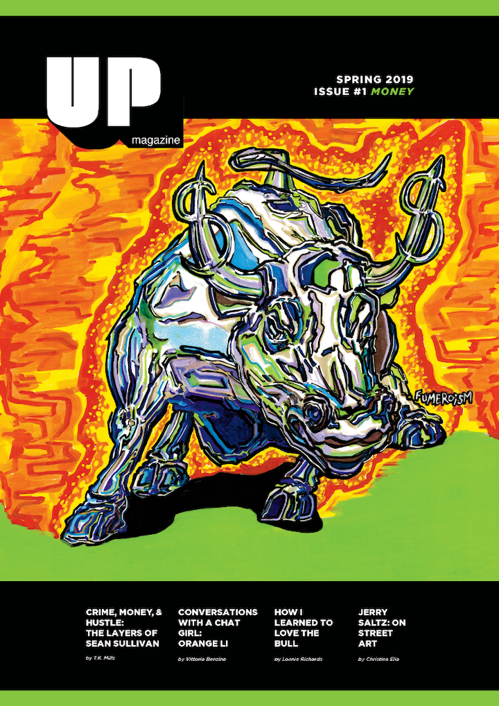
2 Cover of Issue #1 featuring artwork by Fumero

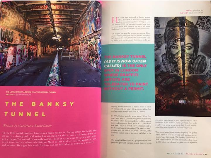
3 Spread from Issue #2,”The Banksy Tunnel,” written by Candelaria Barandiaran with photos by Sabrina Ortolani

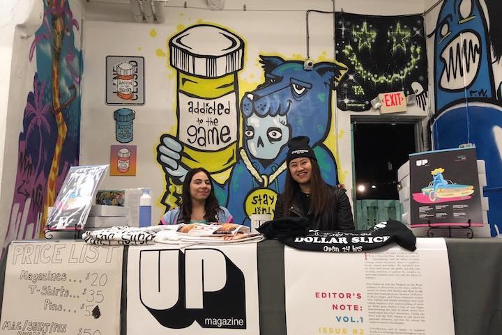
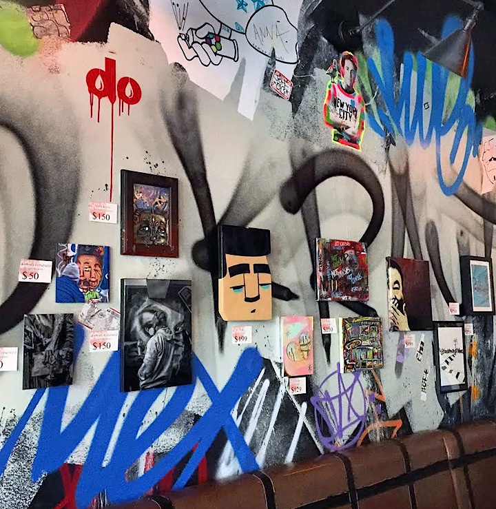
UP pop-up in Miami

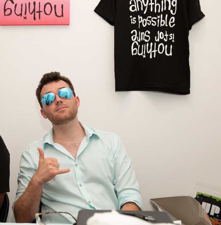
5 Photo of T.K. Mills by Gabriel Ortiz, Jr

{ 0 comments }

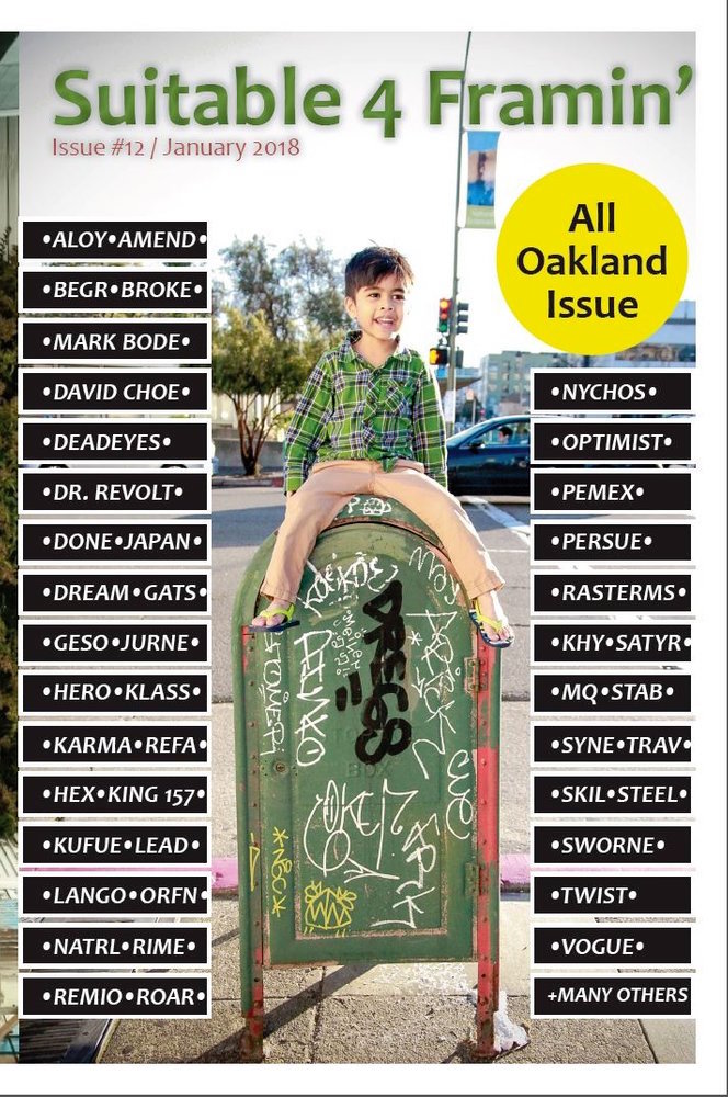
Twenty years ago, Bay Area photojournalist, artist and graffiti/street aficionado Iqvinder Singh published his first  zine — and the first graffiti zine to emerge from Oakland.  Earlier this year, Iqvinder aptly dedicated an entire issue of his ongoing zine, Suitable 4 Framin’to Oakland, dividing it into eight distinct sections from East Oakland and the Oakland Museum of Art to the Oakland Terminal Art Gallery and Tags and Throws. What follows is a small sampling of images in a range of media that made their way into Suitable 4 Framin’, Issue #12:

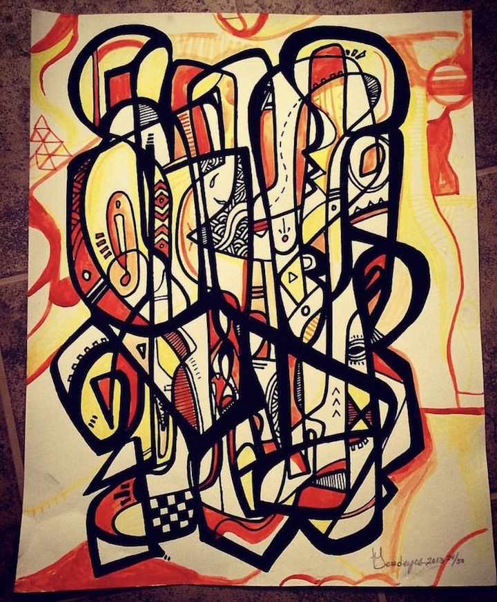
Deadeyes 

RasTerms

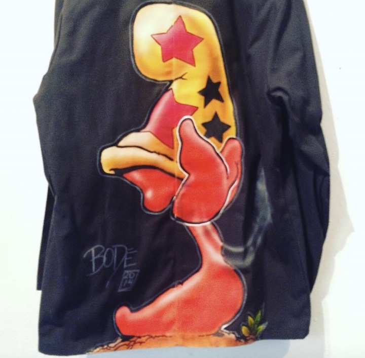
Mark Bode on denim at the Oakland Terminal Gallery

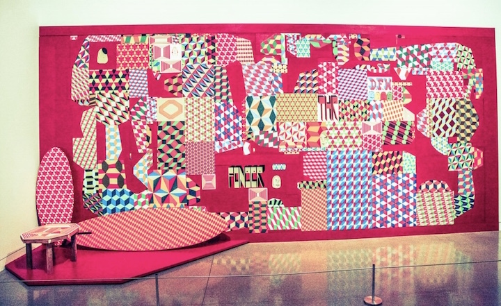
Barry McGee at the Oakland Museum of California

Broke sticker 

This All Oakland Issue of Suitable 4 Framing’ is dedicated to the late Oakland graff legend Mike Francisco aka Dream. You can purchase it, along with a few selected back issues of other zines, here. And each zine comes with a varied assortment of stickers and random goodies!

All images courtesy of Iqvinder Singh

Note: Hailed in a range of media from WideWalls to the Huffington Post to the New York Times, our Street Art NYC App is now available for Android devices here.

en-play-badge 2

{ 0 comments }

UBcover

A Brooklyn-based artist collective with a mission, unbag is planning to release its first arts publication this spring. I recently posed a few questions to unbag co-founder, artist and writer Andy Wentz.

Just what is unbag?  When and how did it all begin?

unbag is an arts organization that runs an ongoing critique group, curates shows with partner galleries, and is now producing its first publication. We started out as a small group of friends who wanted to do group studio visits about two years ago. It was always about supporting the folks within our small community. And this ethos of supporting artists that are underrepresented and share similar values to ours has continued to inspire us to expand the organization.

What is the significance of its title? It’s rather bizarre!

We needed a channel to organize members of our little critique groups, so early on we created a Facebook group to host events and announcements. Our idea to create the Facebook group came before we even saw a need to come up with a name for the group. So we just put it as Un-Named Brooklyn Artist Group and for some reason the acronym unbag stuck. I think it made sense to us as a name because it is a clunky synonym to ‘unpack’ which is what we were doing during the critique group. We’ve since dropped the long form title and are just unbag now.

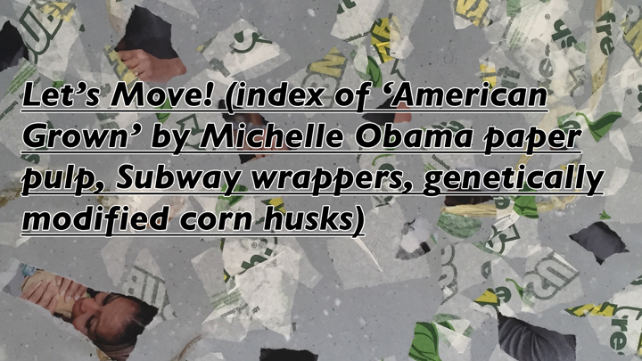
manuel-arturo-abreu-against-the-supremacy-of-thought-7

What prompted you to launch this particular project — a digital and print publication?

My friend, Aaron Cooper, and I were organizing the unbag critique group and leading some panel discussions at an experimental space called Sleep Center in Chinatown.  We started meeting a ton of artists from all over the world through these events, and that’s when we started to get the idea to have a project space of our own. But we weren’t interested in a brick and mortar gallery, and we thought that an interesting alternative would be to host artist projects online and in print. We realized early on that what we were doing wasn’t going to be a journal or a magazine in the traditional sense —  but rather something more malleable that would conform to the types of projects that our contributors are interested in sharing.

Who is your audience? Are their any particular groups you are targeting?

We are definitely targeting people in the art world, but folks who don’t take it too seriously. We’re not aspiring to be the next Art in America or anything like that. We hope to reach people who are interested in art, culture and political practice from artists who don’t necessarily already have a platform to share their work. We also hope that our readers are people who would become future contributors and join in the unbag community.

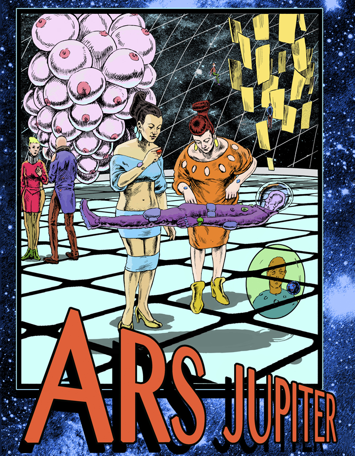
Ars Jupiter Page A 7 x 9 alt

How did you decide what to feature in Issue #1?

We started with an open call for projects that use trickery as a strategy in their artistic production. We were definitely thinking of artists like Sophie Calle and Jill Magid when we came up with the idea for the theme. These artists are subversive and obsessive, and their motivations are not always clear to the viewer. Along with the open call, we also reached out to some artists and writers who, we thought, could contribute great projects because they already had a more subversive practice. We ended up getting about a hundred submissions and finally narrowed it down to thirteen projects that we thought fit the theme and worked well together as a group.

When will your premier issue be officially released?

The project will officially be released in May, and we will be hosting a launch event at Quimby’s in Williamsburg. Stay tuned for an official date for that event.

Loney- Abrams

What are some of the challenges you’ve faced in producing this first issue?

We’ve had to completely build everything from the ground up for this. So that means marketing, design, printing, fundraising, and more. All of these aspects have been a challenge. But we’re banking on the first issue being the most difficult to produce, and that in the future — with all these structures in place — it will be more about just finding the right contributors to feature. So we’re looking forward to the next issue for those reasons.

Note: The unbag Kickstarter continues through this Sunday, March 12.

Interview by Lois Stavsky & all photos of images courtesy Andy Wentz

Images

1. Haleigh Nickerson

2. Manuel Arturo Abreu

3. Peter Rostovsky

4. Loney Abrams & Johnny Stanish 

Hailed in a range of media from Wide Walls to the Huffington Post to the New York Times, our Street Art NYC App is now available for Android devices here.

en-play-badge 2

{ 0 comments }

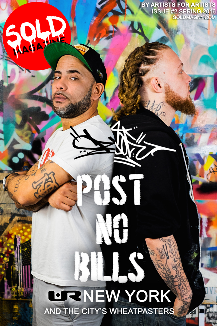
sold-magazine-cover -URNewYork

The second issue of SOLD Magazine — the magazine by artists for artistswas formally launched last night with an Affordable Art Show at Chelsea’s Studio Kraut.  After checking out the art — that had already been installed when I came by — and perusing the magazine, I spoke to SOLD Magazine‘s publishing editor BD White.

Back in January, you, John Paul O’Grodnick and Greg Frederick first launched SOLD Magazine. How has the response to it been? What kind of feedback have you gotten?

The response has been overwhelmingly positive. People were eager to become involved with it. We had a steady stream of encouraging emails, text messages, phone calls and comments. It was the incredibly enthusiastic response to SOLD Magazines first issue that has kept us going!

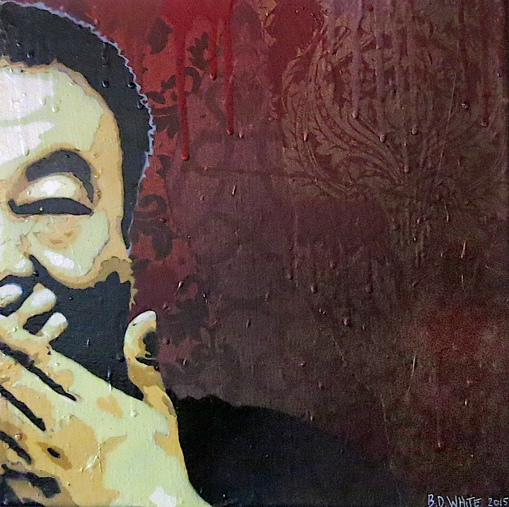
BD-White-stencil-art

How did you go about distributing the premiere issue of your magazine?

We distributed over 3,000 copies — 20 at a time — by getting them anywhere and everywhere! We hit art stores, alternative spaces, cafes, bagel and muffin shops…just about any place that was open to receiving our magazine.

This second issue looks fantastic! There are revealing interviews with UR NEW YORK, City Kitty and Appleton, along with a range of intriguing feature articles. You even have a recipe for wheat paste, this issue’s theme! How was the experience of getting SOLD Magazine out different this time around?

It was easier! Most of the kinks had already been worked out. The actual layout took far less time. And because of the buzz that the first issue generated, artists approached us, as they were eager to be featured.

sold-magazine-installation_pg

Did any unanticipated challenges come your way?

Because everyone who worked with us was so cooperative and accommodating, we were able to easily overcome any potential obstacles.

I like this venue. Even the setting for the artwork is perfect. How did Studio Kraut come your way?

Yes, it is great! The backdrop had already been painted and designed by Dripped On Productions, and Kwue Molly introduced us to this space.

ramiro-davaro-sold-magazine

What’s ahead for SOLD Magazine?

The next issue will focus on muralists. You are in for a surprise! And keep posted for news of our upcoming podcast In the Spray Room.

How can folks get hold of the magazine if it is not easily accessible to them?

They can subscribe. That is the one way they will be sure not to miss an issue!

choice-royce-art

Congratulations! I’m already looking forward to the next issue! I’m heading out now to read this one cover-to-cover!

Pictured above are:

1. Cover of SOLD Magazine  Issue #2 featuring UR NEW YORK, Mike Baca aka 2esae and Ski; photo by John Paul O’Grodnick

2. BD White,

3. Raphael Gonzalez, City Kitty, CB23, JCorp, JPO, BD White and Joseph Meloy

4, Ramiro Davaro

5, Choice Royce

Photos of artworks and interview by Lois Stavsky

{ 0 comments }

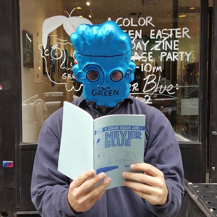
A huge fan of zines and independent publications of all kinds, I was delighted to discover Never Blue, featuring artworks by some of my favorite artists — who make their mark both on and off the streets. Curious about it all, I posed some questions to its curator, Mr. Green aka A Color Green.
Never-Blue-Zine

Just who/what is A Color Green? And when was it born?

At the easiest level, A Color Green aka ACG, Mr. Green or Coloure Greene is an independent, NYC-based artist and curator. Mr. Green was born roughly six years ago, about the same time I began to concoct a haphazard entrance into the film industry. And playing off its founder’s last name,  A Color Green was conceived as a film production company title. Today, A Color Green is both an individual artist and his alter ego, as well as a tight-knit production and publishing team – (though always looking to expand into something new!)

Can you tell us something about its logo?

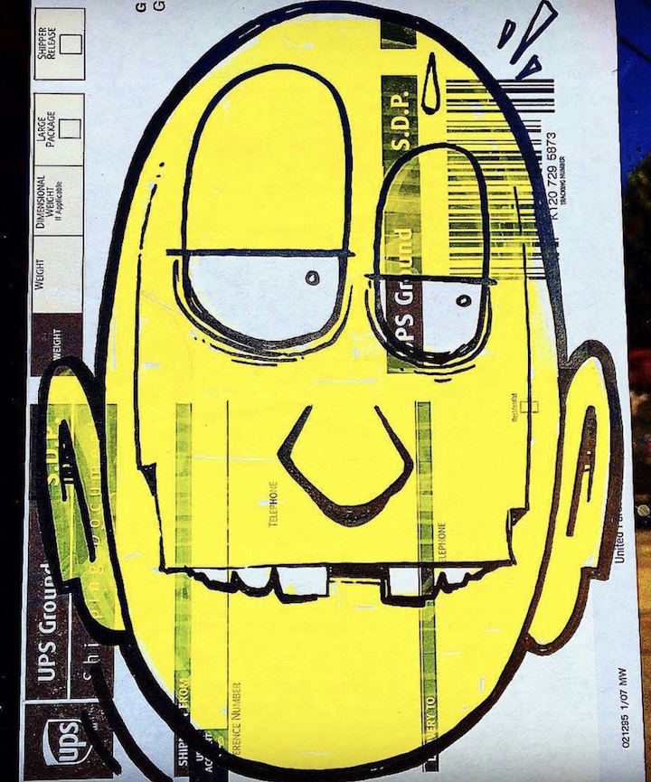
As I began to search for what would be a company “logo,” an immediate connection with the cartoonish face you’ve become familiar with on NYC streets in sticker or tag form was born. Upon realizing the breadth of possibilities or absurdities in this face, ACG expanded into an alter-ego reminiscent of some of my favorite artists or musicians — graffiti legends like Snake 1, contemporaries like Chris RWK and Frank Ape and pop-culture icons like MF Doom, Quasimoto or Big L, Stanley Kubrick, Quentin Dupieux, Roger Ebert and more.
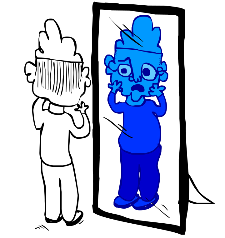
Mr-Green-Mirror-Image

What spurred you to take Green to the streets?

When I moved back to NYC a few years ago, I didn’t have the resources to pursue my own filmmaking. And inspired by those contemporary artists, I decided to try taking Green to the street, tying in film references. A big inspiration was my intent to develop a curatorial channel to feature these very artists.  And as that “channel” continues to grow, so do the partnerships and connections that have allowed me to branch back into some of my original inspirations in filmmaking and publishing which, of course, leads right back to this interview, Never Blue and some upcoming projects.
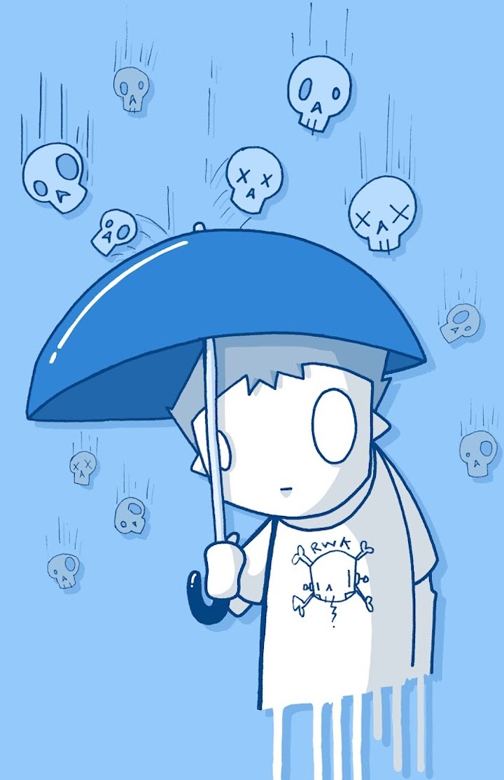
Chris-RWK-keeping-the=blues away

Never Blue is Volume 2 of the zines produced by A Color Green. Can you tell us something about Volume 1? Is it still available? What spurred you to produce Never Blue?  What is the concept behind it?

A Color Green Zine was conceived as a trilogy, each installment correlating to a different side of my character, inspiration, aesthetic and — I suppose — humor. As an artist, I’ve always identified with those masterful creators like Picasso or Kubrick who understood the importance of change and redefining one’s self throughout a career. This trilogy is a direct nod to something like Picasso’s Blue Period or Kubrick’s ability to produce Barry Lyndon directly after A Clockwork Orange. The styles are so radically different, but through the change you still catch a similar glimpse of what drew you there in the first piece — whether a feeling, face or something else entirely. 

Our first edition, Black and White was also a limited edition risograph print co-published by Endless Editions  — as the entire trilogy will be — and featured roughly thirty artists, a number of whom are also featured in Never BlueWhile Black and White was meant to adhere to that gritty, DIY style — which I’d strictly adhered to for two years — Never Blue, was meant to be a sad or celebratory, soulful or seductive step away from the simple shades of B&W. If you missed out on the sold-out first edition, you can download a free copy of the A Color Green Zine Vol. 1 Black & White now on BitTorrent.
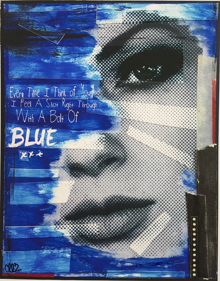
Blue

Works by dozens of artists representing a wide range of styles, sensibilities and cultures are featured in Never Blue? That’s quite impressive. How did you decide which artists to include? How did you reach out to them?

While Never Blue is the second official zine I’ve created with A Color Green, it’s actually our third publication following a small print we released over the summer called the Green Carpet Zine. Like I said, we had always intended to make A Color Green Zine an official trilogy, and receiving the proper submissions took some time — so much so that we took a break and created the entirely random Green Carpet Zine.

What differentiates the Green Carpet Zine from the official ACG trilogy is an emphasis on street art and representing that style in an illustrative or photographic form on the page. There were a number of artists I knew who had to be in it – starting with several highly talented friends including: HausRiot, Kristy Elena, Seth Laupus, Zero Productivity, Leaf8k and JCorp TM who were in the first edition. Next, I needed to reach out to some of my favorite contemporaries like Brolga, CEEZ, Chris RWK, City Kitty, Murrz, Abe Lincoln Jr. and Frank Ape who’d inspired me to get back into street art. And as I often find with that community, everyone was wonderfully supportive. I also opened up submissions to artists via the Con Artist Collective where I received dozens of illustrations that were incredibly difficult to choose from. The remaining slots were announced via social media where another couple of dozen artists responded.

Unfortunately, not all of the artwork could make it in, and that’s where we needed to put on the curatorial hat and figure out which submissions not only fit the theme, but worked together in a layout as well. Emphasizing the different styles is very important to us, and when you flip through the zine, you’ll find we pair similar styles together and contrast different looks. The result is a blend of hand-style, graphic design, illustration, wheat-paste and whatever else.
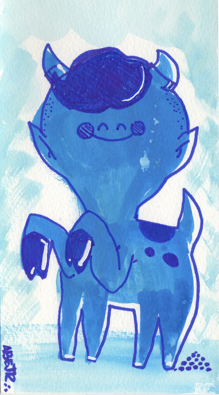
Abe-Lincoln-Jr

What was your greatest challenge in getting this zine out? How did you promote it once it was published?

Time is always the greatest challenge. The balancing act of juggling work, life and responsibility. Every artist who submitted to the zine — whether anonymous or not — has a life outside of their alter-ego, and so do I. We couldn’t dictate a strict delivery for some submissions, because we desperately wanted some artists to partake, and I would have pushed the printing back for some people if need be.  But after receiving over fifty submissions, we knew we had to cut it off and set a release date. That release date, after two years gave ACG and Endless Editions the much needed fire under our asses, and within two months we had two hundred fresh risograph copies and an opening set at Con Artist NYC where another 25 artists donated work to hang on the walls.

Promoting after such a long build up was the easy part and it took place mostly via social media — across 30 somewhat artist pages on different platforms — in addition to a couple of NYC art listings and press releases. Con Artist also has been a major champion of our work and promoted it heavily across their channels.
MURRZ-Never-Blue

What’s ahead for A Color Green?

Up next for ACG is a long-awaited rest from zine curation and my official directorial debut in MUTE which will have its hometown world premiere with the BK Horror Club and Brooklyn Horror Fest tomorrow, April 21. The short film features Danish star Albert Bendix as a tongue-chopping madman and is followed in double-feature form by a screening of the modern-classic You’re Next, sponsored by Throne Watches and Narragansett Beer. Tickets can be purchased here. And If you’re yet to check out Never Blue, you can buy a copy at Con Artist while supplies last or head over to Printed Matter, Inc where the zine will go on sale later this month. More on www.acolorgreen.com.

Interview by Lois Stavsky; all images courtesy Mr. Green

Images: 

1. Mr. Green with Never Blue

2. Mr. Green

3. Chris RWK

4. Ceez

5. Abe Lincoln Jr.

6. Murrz
{ 0 comments }

Jily-Ballistic-and-JPO-art-17-Frost

SOLD Magazine launched this past Thursday evening with an exhibit — co-curated with Ellis Gallagher — and party at 17 Frost. When I stopped by early in the evening, I had the opportunity to speak to John Paul O’Grodnick, who — along with Greg Frederick and BD White — made it all happen.

 Just what is SOLD Magazine?

SOLD Magazine is a free magazine by artists for artists and art lovers. Among its features are: artists interviewing each other, studio visits, artist and photographer profiles, a travel section and much more.

What motivated you thee to launch it?

A sense that artists need a new platform for exposure. Our mission is to provide that platform.

chris-rwk-art-17-frost

 When did you guys first begin working on SOLD Magazine? And how did you fund it?

We began working on it at the beginning of October, and we funded it via a Kickstarter campaign.

It’s great that your campaign was so successful! What has been your greatest challenge in seeing this through?

Rounding up the artists whom we wanted to participate in our venture.

raquel-echanique-17-Frost-exhibit

 Was it an open call? How did you decide which artists to include?

No! It was artists we’ve known and worked with in the past. Some of them suggested others.

How often do you expect to publish SOLD Magazine?

Once every three months. It is intended as a quarterly.

elle-art-17-Frost-nyc

How will folks be able to get hold of it?

We plan to make it available in galleries and museums throughout the city, as well as in local businesses here in Williamsburg.

I notice that this premier issue focuses on female artists, with your first cover featuring Gilf and Elle. What can we expect in future issues?

Every issue will have a theme. Our next one will focus on collaborations.

Ramiro-Davato-art -at-17-Frost

 That sounds great! Congratulations!

Note: The above images of are of works that were on exhibit and for sale at Thursday evening’s SOLD Magazine‘s launch:

1. Jily Ballistic and John Paul O’Grodnick aka JPO

2. Chris RWK

3. Raquel Echanique

4. Elle

5. Ramiro Davaro

Interview by Lois Stavsky and photos by Tara Murray

{ 0 comments }

The following guest post is by Houda Lazrak, a graduate student in Museum Studies at New York University.

MH Cover

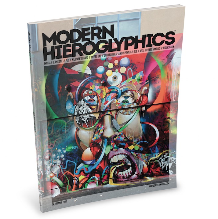
Presenting a distinctive global perspective on art, music, fashion and culture, Modern Hieroglyphics — readying now for the release of its second issue — premiered this past summer. Co-founded by adventurous designer Jack McKain and West Coast-based artist Chor Boogie, the 156-page publication features fascinating interviews with ten talented artists, along with dozens of photos.

Tapping into graffiti history, the term Modern Hieroglyphics was first coined by San Diego-based Blame One. The term was then popularized by Chor Boogie to define his personal style. Finally, it was re-adapted to serve as the title and theme for this magazine’s spirit – a belief in the inherent power of visual communication through pictures and pictographs.

Meres-One-5-Pointz-Modern-Hieroglyphics

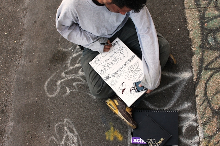
The interviews, conducted by McKain, are first rate. Meres One, for example, recounts his experience as curator of Long Island City’s 5 Pointz, along with his tenuous fight against gentrification and the whitewash of the iconic legal graffiti space. In another interview, Noah Scalin describes his Skull-A-Day project. To challenge his creative capacity and test his commitment abilities, the artist embarked on a one-year venture to fashion a skull image from different materials every day. Scalin describes how he garnered an online following and transformed what was a personal project into a public one – a creative commitment that, he confesses, became addictive. 

All of the interviews are accompanied with strikingly beautiful images and end with links to relevant social media.  To promote the role of photographers in the creation process of Modern Hieroglyphics, the publication also includes clear photo credits and devotes the final page to photographers’ contact information.

Shaka-Modern-Hieroglyphics

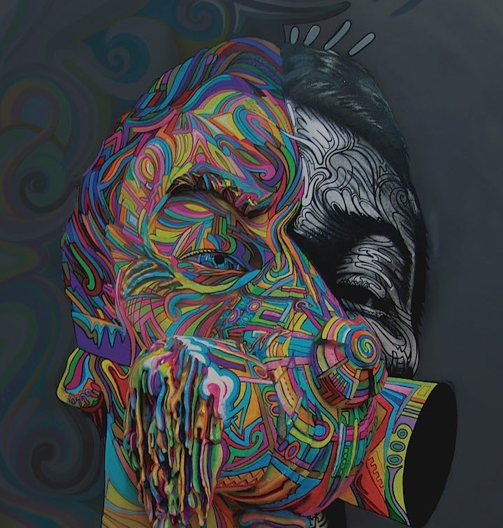
Certain to appeal to us street art and graffiti aficionados, Modern Hieroglyphics is a widely creative platform that exposes the talents of international artists through captivating imagery and engaging text. 

Note: In addition to its website and Facebook page, you can also follow Modern Hieroglyphics on Instagram as it readies for the release of its second issue.

Photos: 1. cover and 3. Shaka (close-up) courtesy of the publisher; 2. Meres One by Dani Reyes Mozeson as featured in Modern Hieroglyphics

{ 1 comment }